Vehicle Branding: The Do’s and Don’ts
To get the most out of your vehicle branding investment, you’ll need to recognize how to best represent your company with quality graphics and how not to become a local nuisance.
On average, we Americans spend more than 17,600 minutes driving a year (1). About 86% of us drive to work or commute in some way via vehicle (2). Percentages aside, what this all ultimately means is we spend a lot of our time in and around vehicles.
It goes without saying that many businesses take advantage of our vehicle and commute-bound situations and use vehicles as advertisements. Simply by driving to and from their place of business, a vehicle advertisement can get 30,000 to 70,000 daily vehicular impressions (3). Think about that! Even if you’re not actively reading that home builders advertisement on the side of that truck on your way to work, you’re being exposed to it, and somewhere, in the back of your head, you’ve subconsciously acknowledged that information.
If those numbers don’t convince you of the power of vehicle wraps and graphics, consider these statistics. On average, a full vinyl wrap will cost between $1,500 and $3,000 (4). According to the the Outdoor Advertising Association of America (OAAA,) vehicle wraps cost less than $44 per million impressions, compared to outdoor signs at $3.56 per thousand impressions, and newspaper ads at $19.70 for per thousand impressions. Pretty significant cost difference, right?
Now, before you decide to slap on a magnetic sticker on your truck or plaster your business van with a giant wrap, take note of these do’s and don’ts. If you don't have a logo yet and are wondering what to include in yours, check out these construction company logos.
1. DON’T overload your vehicle with graphics or information. DO keep it simple
Think of what your most important information is. This should be your contact information, your business name and the basics of what you do. This doesn’t mean listing every single service you offer all over your vehicle, with clipart as examples.
Don’t do this. Way too much going on.
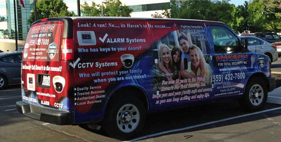
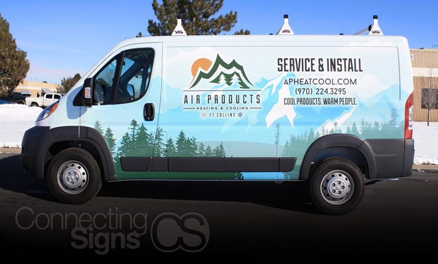
Remember that you’re branding your vehicle, not a stationary object (and even if you are branding a stationary item, please don’t do this!) Your audience has just a few seconds to digest the information. Be clear and concise. Also make sure to create a wrap that’s consistent with your branding design (i.e. use the same logos, colors, fonts, etc.) This will help viewers recognize your brand and company.
The Air Products vans installed by Connecting Signs may be graphic heavy, but by no means is it overwhelming. The company’s name, phone number and website are easy to find and read.
2. DON’T use overly flowery font. DO use a font that can be read from a distance.
When collaborating with your marketing company or with your sign/print company, make sure to select a font that’s easy to read from a far. While your first inclination may be to the select the unique Lobster font, your potential customers are going to have a much easier time reading a more traditional font, say Calibri.
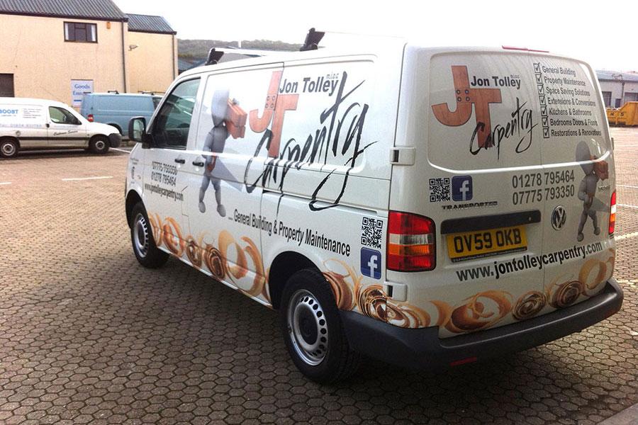
The cursive “Carpentry” in JT’s Carpentry is difficult to read. Not such a great thing when that word describes what you do. (Another thing to note is the QR Code. How are we supposed to scan the code? If we have the app, should we use our phone to scan the code when we should, you know, be driving?)
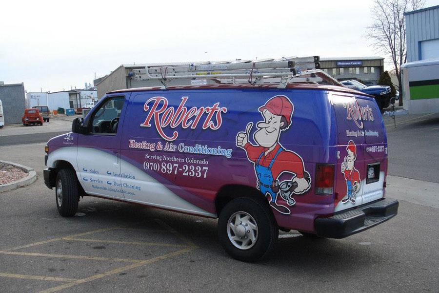
While “Roberts” uses a decorative font, it’s still easily read from near and far. Wrap installed by ActionSigns
3. DON’T just use branding on the vehicles sides. DO remember your vehicle is a three dimensional object.
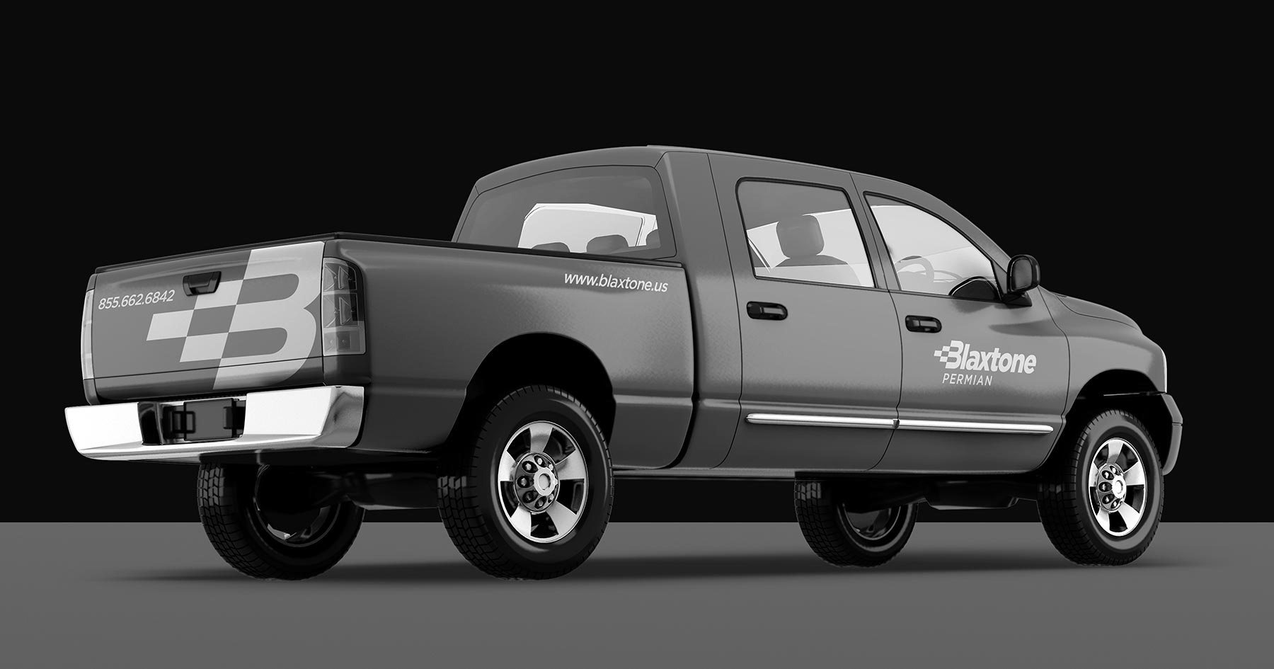
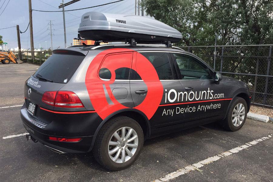
Your vehicle can viewed from in front, the sides and the back. Make sure critical information, like your phone number and website, can easily be read from the sides and back of your vehicle.
On the other hand, do be aware that not all vehicles are created equal. When designing your wrap or smaller graphics, be sure to design for the vehicle you plan on advertising on. Certain aspects of vehicles, say bumpers, certain windows or rails, may not be able to be covered or in some states, it may even be illegal. Be sure to discuss what is possible too with your wrap installer.
In some states, like Wisconsin, decals on any car windows are illegal. Thankfully in Colorado, as long as your vision is unobstructed, window wraps are A-OK. Wrap by Fineline .
4. DON’T use poor quality photos on your vehicle. DO use professional photography.
If you decide on using photo images when branding your vehicle, please for our design-loving-sakes, get your images from a professional commercial photographer. Even if your company vehicle is a little smart car, any images used to brand that vehicle will need to be enlarged significantly in order to be easily seen. A fuzzy or grainy image on a company vehicle, frankly, looks unprofessional. You want your vehicle's branding to reflect the high-quality work you do.
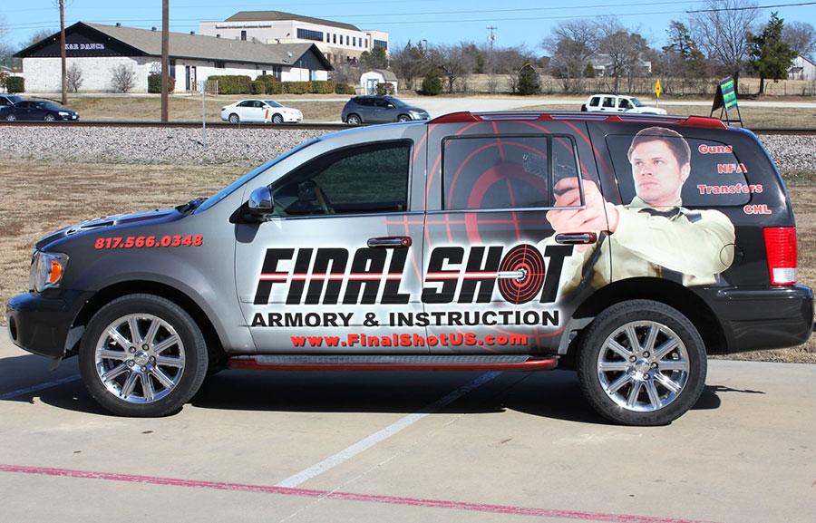
Final Shot has a dynamic enough wrap, but the poor photo quality/cut out leaves the overall design a little worse for wear. If you’re going to invest so much into a full wrap, invest in your photography too!
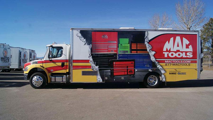
This Mac Tools truck is an excellent example of great professional product photography and a creative wrap design. Wrap installed by SBW Graphics .
5. DO send the right message. DON’T confuse your customers.
If you take anything away from this article, take note of this tip. When it comes to branding your vehicle, whether with a full wrap or a simple vinyl sticker, you need to create a design that is appropriate for your business.
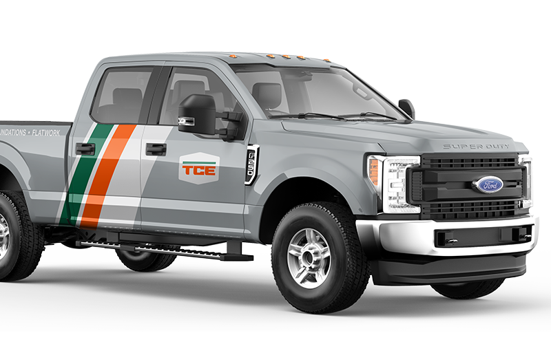
For example, a commercial construction company may just need a logo, website address, and phone number. This doesn’t necessarily mean your design has to be “boring” though. Adding a colored hood or an oversized graphic is great way to differentiate your construction business, remain professional and not be too conservative.
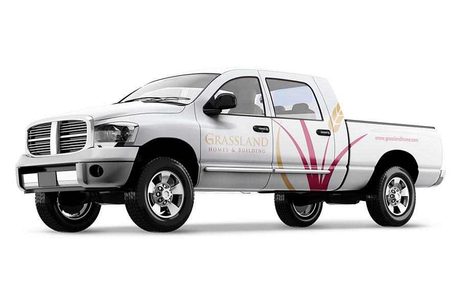
This Grassland Homes & Building truck manages to attract attention without gimmicky graphics or out of place colors. The oversized graphic doesn’t compete with the important information either. Designed by us!
Let’s look at a different kind of business. A residential lawn care company may want to be more colorful and neighborhood friendly; the vehicle will be seen outside multiple homes and will most likely be seen by a variety of ages.
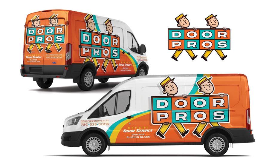
Take Door Pros for example.
KickCharge's playful design is fun and manages to remain professional. It’s a vehicle you wouldn’t mind having parked outside your house for a few hours.
Ultimately it comes down to the message you are trying to convey and who you want to send the message to. If you’re on commercial job sites, then you want to be the conservative and no-nonsense professional, not some flamboyant up-start. On the flip side, if you’re working in residential neighborhoods then you want to be promoting a friendly mascot that is approachable and fun. An image that people immediately feel comfortable having in their neighborhood around their kids.
6. DON’T be boring. DO make a statement.
Like we mentioned before, being professional doesn’t automatically mean a boring design. This is where you designer can come in and help you think outside the box; something that peaks people’s interest but doesn’t run them off the road, so to speak.
Take Kinetic Industry for example.
Kinetic Industry is a hydro excavating, industrial strength cleaning, and utility locating service. AKA they do important, dirty work that requires (large vehicles,) which are great canvases to advertise on. Bright, playful and colorful branding on their vehicle just wouldn’t send the right message. Then again, having plain vehicles wouldn’t be very exciting or take advantage of the situation.
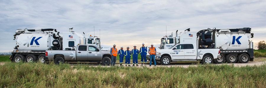
Our goal was to create branding for Kinetic Industry’s vehicles that were both professional and out of the ordinary. While most industrial strength cleaning vehicles are plain (think white or hazard yellow,) we placed an oversized version their (logo graphic) on their vehicles’ tanks. This large graphic made Kinetic stand out from the crowd and was a great way to advertise to onlookers just who was getting the job done.
Kinetic Industry’s trucks were branded similarly. Whether silver or white, the trucks had the same oversized graphic, matching brand colors and easy to read contact information. Neither over the top nor boring, Kinetic Industry’s branded vehicles are the perfect mix of professional and original.
Lastly, remember you’re driving an advertisement of your business.
Drive well, keep it clean, and take pride in your design. Your vehicle is a direction reflection of your business—how you drive and maintain it will have an impact on how potential customers view your company. Now, take advantage of your company’s moving billboards and advertise the right way!
If you are reading this article, you might be wondering if hiring a branding design agency will help your business. Check out our marketing case studies to get an idea of how we can help you.
If you are interested in learning more about our approach to the items discussed in this article, call (970) 744-3611 or send us an email so we can talk about what that would look like.
References
- http://newsroom.aaa.com/2016/09/americans-spend-average-17600-minutes-driving-year/
- https://www.theatlantic.com/national/archive/2011/07/the-geography-of-how-we-get-to-work/240258/
- http://www.advertiseyourdrive.com/ARD_WhitePaper.pdf
- https://quickbooks.intuit.com/r/local-marketing/are-vehicle-wraps-a-good-investment-for-your-small-business/


