Logos for the Top 10 Construction Companies in the US
When hiring an agency to design a logo for your construction company, it can be tempting to ask for an illustration of what you build, your favorite equipment, or the tools of your trade. Maybe even all three.
You may be surprised to know that none of the top 10 construction companies in the US (1) have construction related symbols or illustrations in their logos.
Most construction firms on this list use a wordmark—the simplest type of logo design. A wordmark is just the company name without any symbols, mascots, or badges. There is only one of the top construction companies in the US that uses a complicated logo.
If you are reading this article, you might be wondering if hiring a branding design agency will help your business. Check out our marketing case studies to get an idea of how we can help you.
Our countdown includes a little information about each company plus an opinion of their logo. Pictures are also included so you can see how the top 10 construction firms use their logo.
10) Tutor Perini
![]()
ABOUT
Tutor Perini Corporation (formerly Perini Corporation) was established in 1894 and is headquartered in Sylmar, California. They have completed many large-scale, complex construction projects throughout the United States for private clients and public agencies. Specific areas of focus are civil infrastructure, building infrastructure, and specialty contracting.
OPINION
The Tutor Perini logo uses Helvetica Neue Black. It can be a great font choice for a construction logo. The letterforms are strong, easy to read, and even though Helvetica has been around for a long time, it still has a modern look.
That being said, this wordmark logo does not look finished. Not enough time was spent polishing the idea. The wordmark is not unique and there are some problems in some applications.
The gray and green color combination doesn’t work. The color tone of both words is too similar. A better choice would have been to choose two colors with more contrast or simplify it by using one color.
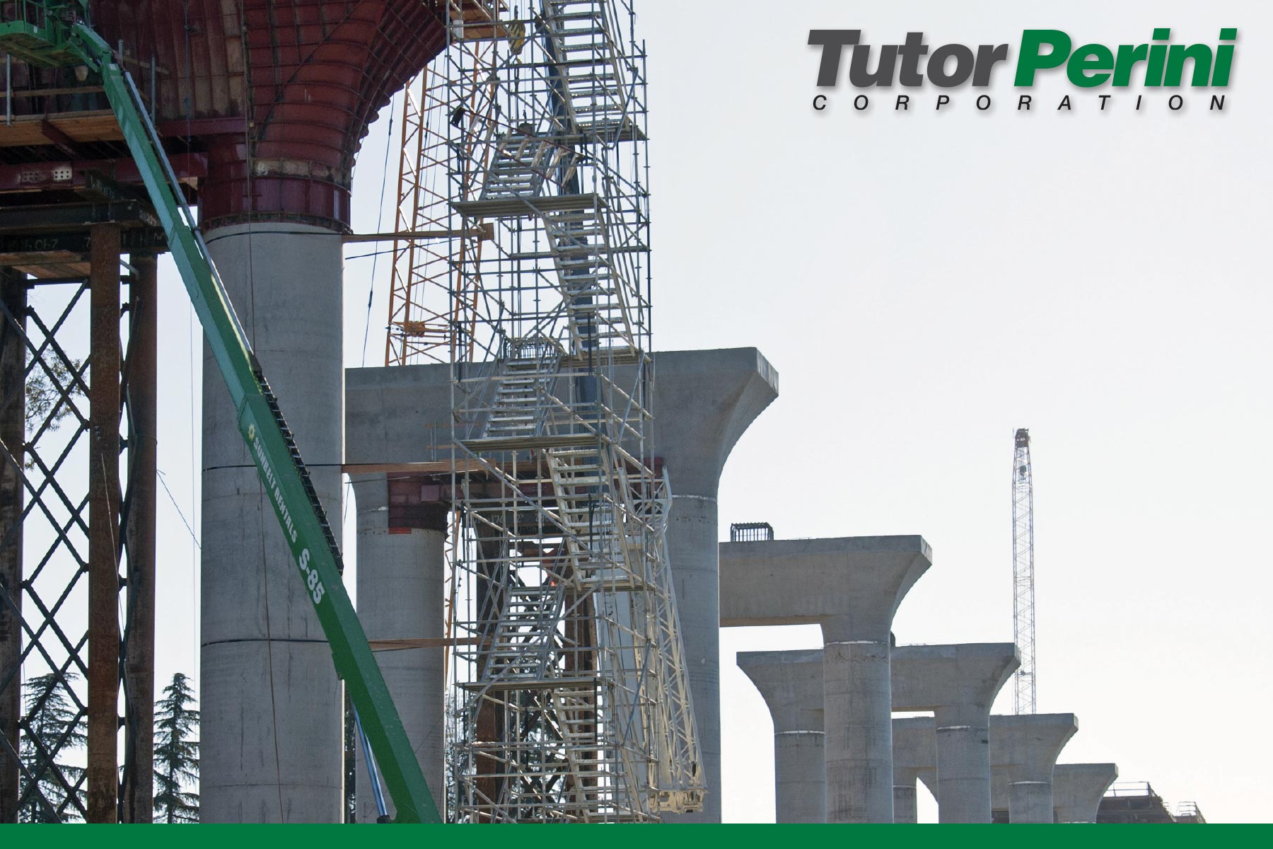
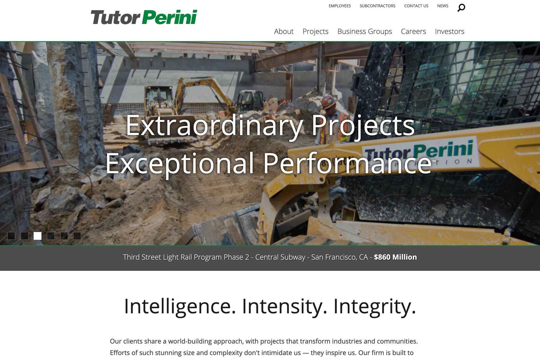
Tutor Perini’s annual reports show how the logo works on a light background but not a dark one. They tried to fix it by going with an all white logo but then their annual reports are inconsistent from year to year. They also are using a drop shadow on print materials and no drop shadow on the website. These inconsistencies could have been avoided if time was taken to work through them when the logo was initially created.
9) McDermott
![]()
ABOUT
For more than a century, McDermott has been designing and building end-to-end infrastructure and technology for the oil and gas industry. Headquartered in Houston, Texas, they employ approximately 32,000 employees.
OPINION
This logo is well done. The sans-serif font is clean, modern, and corporate. The outline below the wordmark is an interesting touch that has a practical use throughout their branding. On the website it symbolizes their end-to-end services. It’s also visually interesting the way it frames the M on the abbreviated version of the logo.
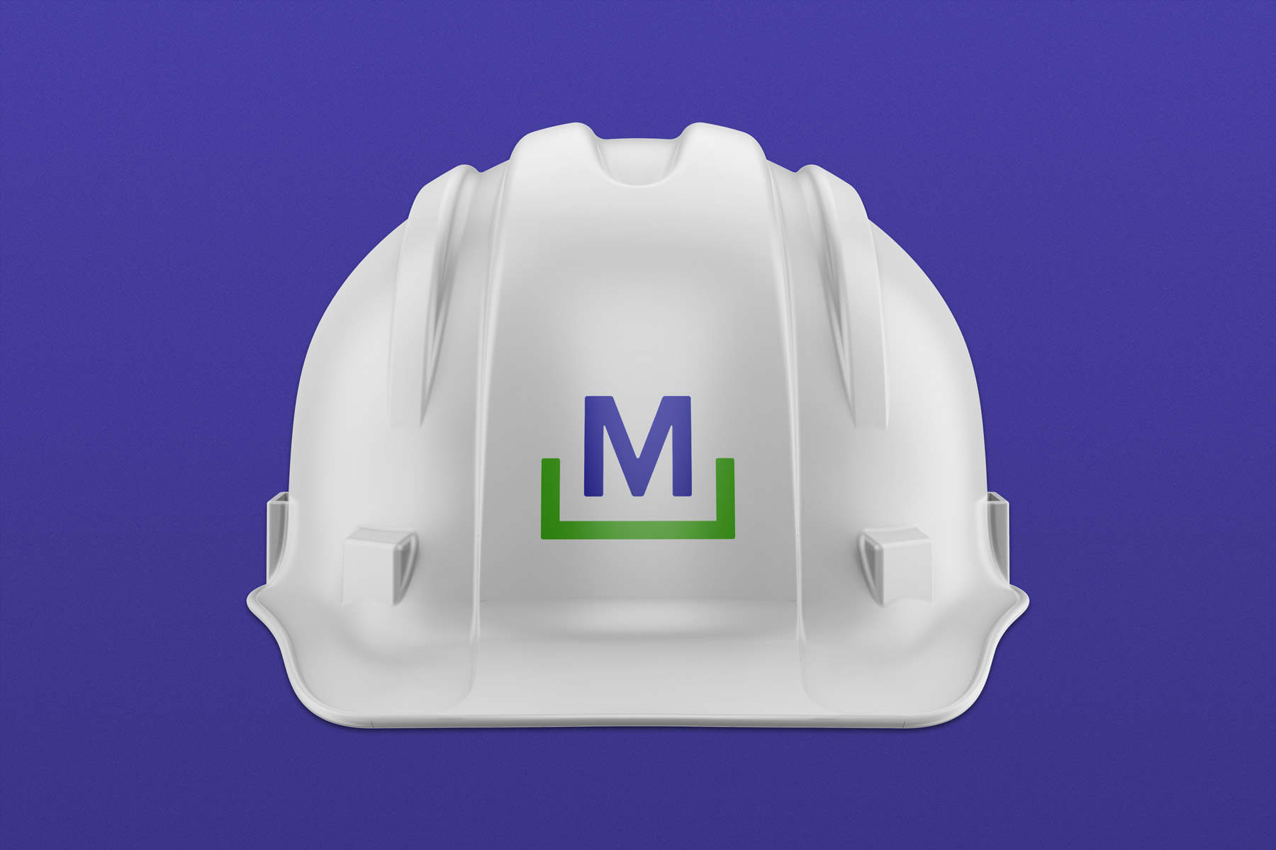
At first I didn’t really like the bright blue and green colors. It reminds me of early web design when everything was really bright. After looking through their website and seeing how well it works on their marketing materials, it has grown on me.
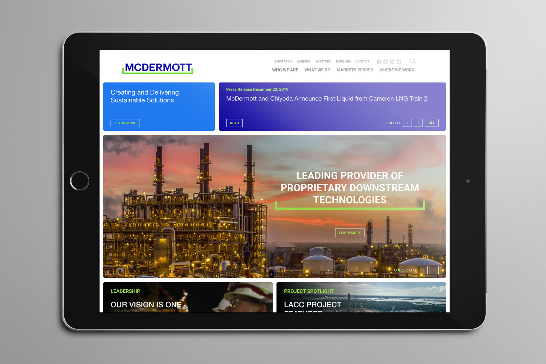
8) Whiting-Turner
![]()
ABOUT
Whiting-Turner provides construction management, general contracting, and design-build on projects small and large for a diverse group of customers. They have been in business since 1909 and employ over 2,900 salaried professionals.
OPINION
The WT with the underline is a great lettermark for a construction company. It is strong, easy to read, and recognizable from long distances. The color orange is a good choice because it reinforces their dedication to safety and stands out on both light and dark backgrounds.
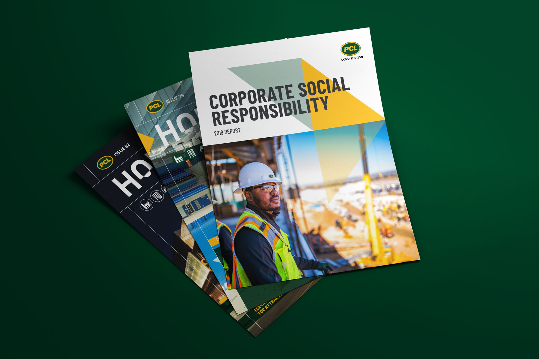
7) PCL
![]()
ABOUT
PCL was founded in 1906 and incorporated in 1913 as Poole Construction Company Limited. The PCL group of independent construction companies primarily works in the civil infrastructure, heavy industrial, and commercial buildings markets. Their United States headquarters is located in Denver, Colorado.
OPINION
The PCL logo covers all the technical bases. It stands out on any background thanks to the thick oval outline. The yellow and green color combination gets your attention. The logo design is simple enough to work on everything from hard hats to brochure designs.
This logo is so simple that it is boring. I guess it is ok, but it doesn’t give me the impression that this is the mark of a company leading the way in their industry. Technically, it checks all the boxes. Visually, meh.
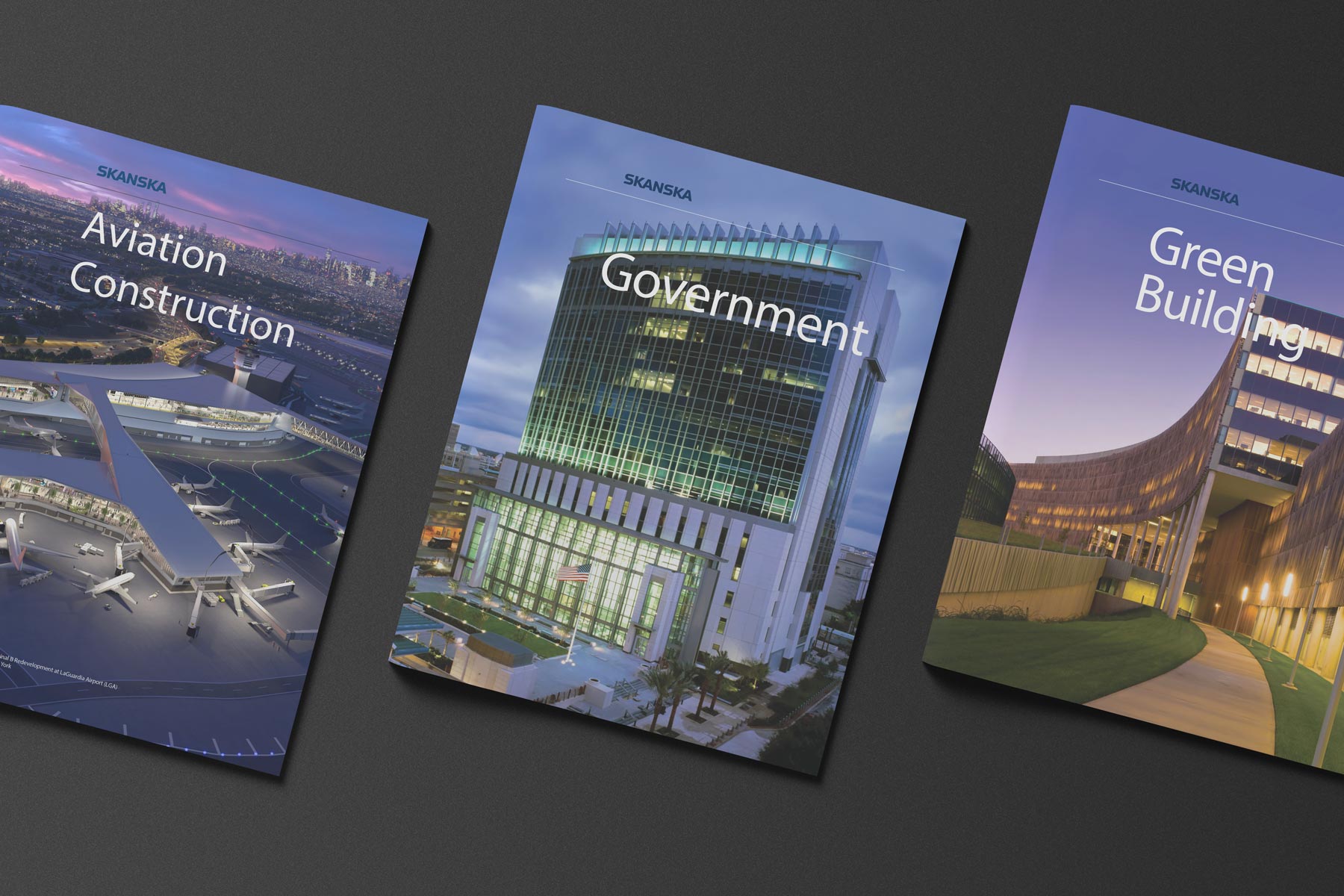
6) Skanska
![]()
ABOUT
Skanska USA has more than 10,000 employees and is headquartered in New York with offices in 34 metro areas. They serve a broad range of clients including those in transportation, power, industrial, water/wastewater, healthcare, education, sports, data centers, government, aviation, and commercial. Their parent company, Skanska AB was founded by Rudolf Fredrik Berg in 1887 and is headquartered in Stockholm, Sweden.
OPINION
You may have noticed that the Skanska logo is the only one on the list that is not presented as a white logo on a colored background. Why? Because in their 248-page Logo and Branding Handbook they specifically state: Do not use a white Skanska logo on blue backgrounds. 248 Pages! Skanska is serious about their logo and how it is represented. Large companies like Skanska keep all of their branding materials visually consistent by creating branding handbooks. They use guides like this internally and to share with vendors working on their projects.
From the SKANSKA logo and branding handbook:
The Skanska logo is the most important visual symbol of our brand. It is the primary carrier of our identity and the values associated with our brand. In many contexts, the logo is the only sign of our corporate identity. Accordingly, it is important that we have strict regulations for the use of the logo to ensure consistency in communication across markets and Business Units. All reproduction of the logo must be made from the original artwork.
Skanska does a brilliant job with their logo and branding applications. It is a simple and modern wordmark that projects strength, sophistication, and forward thinking design. Their color palette combines the distinctive Skanska blue with fresh, modern colors sending a message that they are not just another traditional construction company.
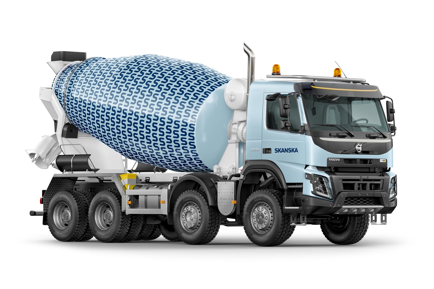
Their handbook even includes instructions for the right way to wrap construction vehicles. This cement truck is cool!
5) Kiewit
![]()
ABOUT
Kiewit is one of North America’s largest and most respected construction and engineering organizations. The company, Peter Kiewit Sons, Inc., was founded in 1884 and is now owned by employees and Kiewit family members. Kiewit serves the transportation, oil and gas, electrical, power, and waterworks industries.
OPINION
The wordmark for Kiewit is created with the font Arial Black. It is an extra bold font that is a natural fit for construction companies. Normally, using a font straight out of the box makes a logo look unfinished, but in this case, it works extremely well. The yellow and black colors are bold and energetic. With this color scheme, Kiewit trucks get recognized immediately on the jobsite.
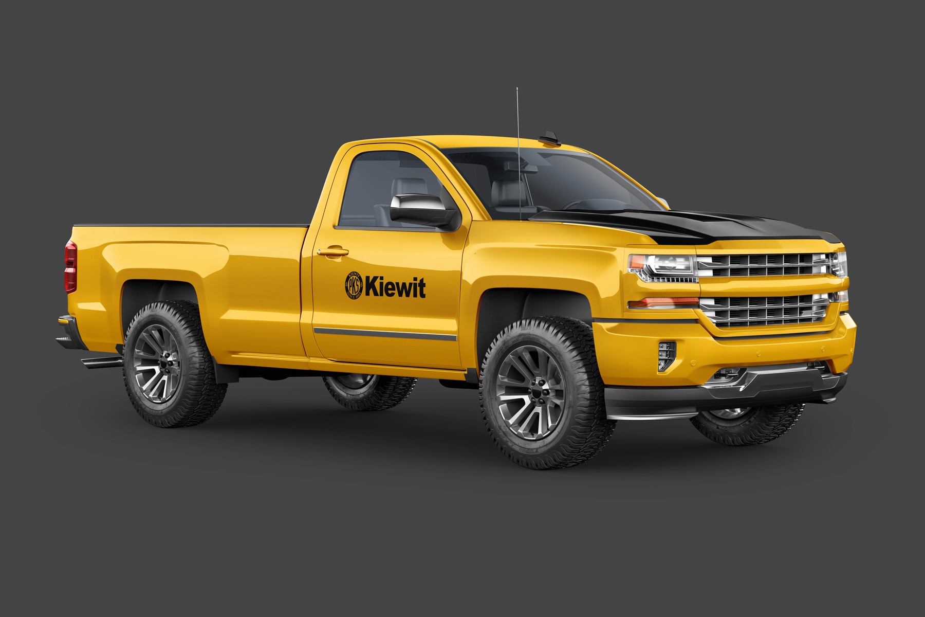

This is the only logo example on our list that pairs a symbol with the wordmark. The initials PKS honor Kiewit's heritage. The symbol isn’t a modern design but it looks like it was refined. It's used on their website and vehicle graphics but is missing from much of the company store swag. Perhaps they are moving away from it?
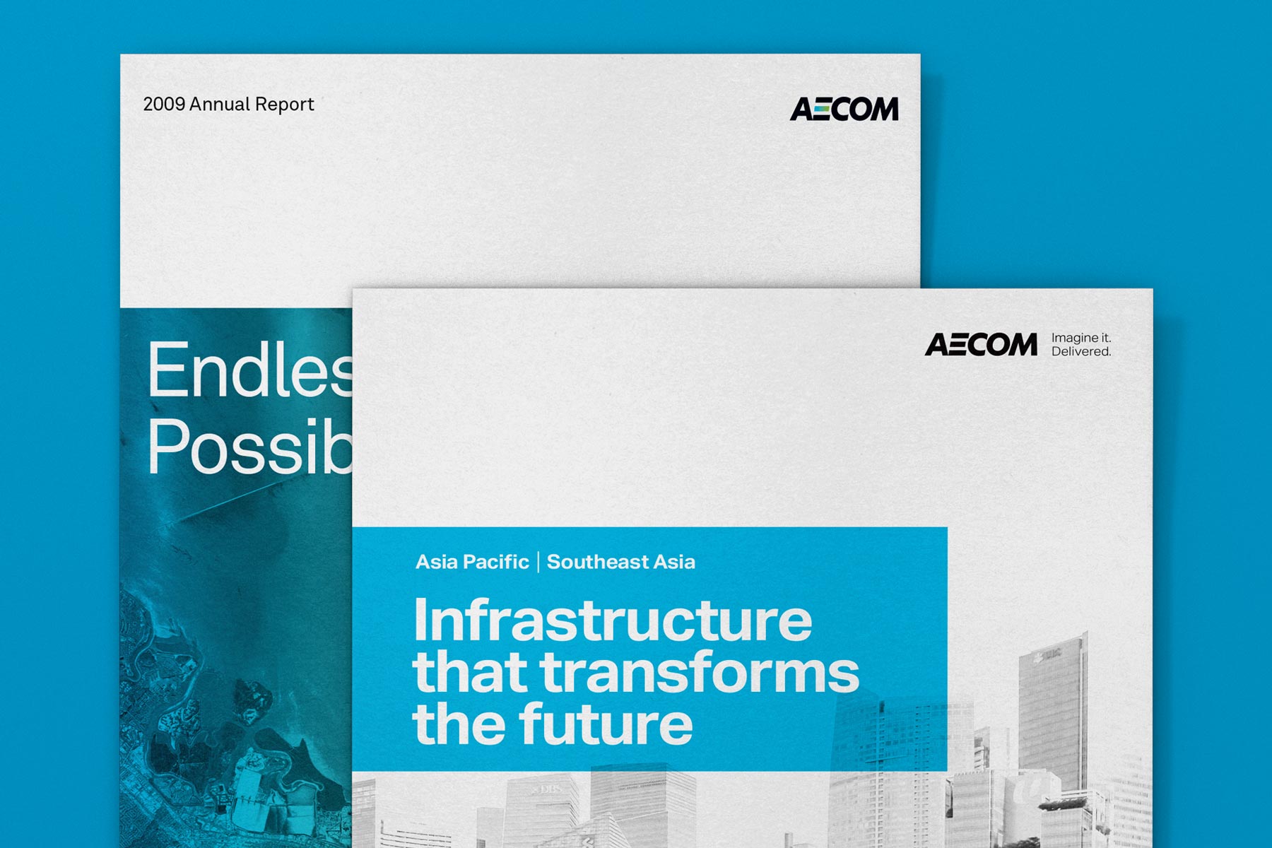
4) AECOM
![]()
ABOUT
AECOM traces its origins back to 1910. The company's official name from 1990 to 2015 was AECOM Technology Corporation, and now it is AECOM. They are a global provider of architecture, design, engineering, and construction services with approximately 87,000 employees.
OPINION
Towards the end of the year in 2009, AECOM introduced a new brand positioning and logo design created by Landor (2). The logo is based on the font Futura PT Heavy Oblique (Italic) with one noticeable modification. The “E” is missing the stem, giving it a modern look that is quite creative for a major corporation.
3) Turner
![]()
ABOUT
Turner Construction Company is an American construction company averaging 1,500 construction management and general contracting projects per year. Founded by Henry C. Turner in 1902, their headquarters is located in New York City, New York. According to Engineering News-Record's 2014 Top 400 Contractors Sourcebook, Turner is the largest "Green contractor" in the United States.
OPINION
The wordmark logo for Turner is a modified version of Helvetica Black. It demonstrates how simple adjustments to the font can make a huge difference in the way it works for various use cases. The extra thick lettering paired with the dark blue and white color palette has a clean professional look. Just what you would expect from a company that has been in business for over 100 years.
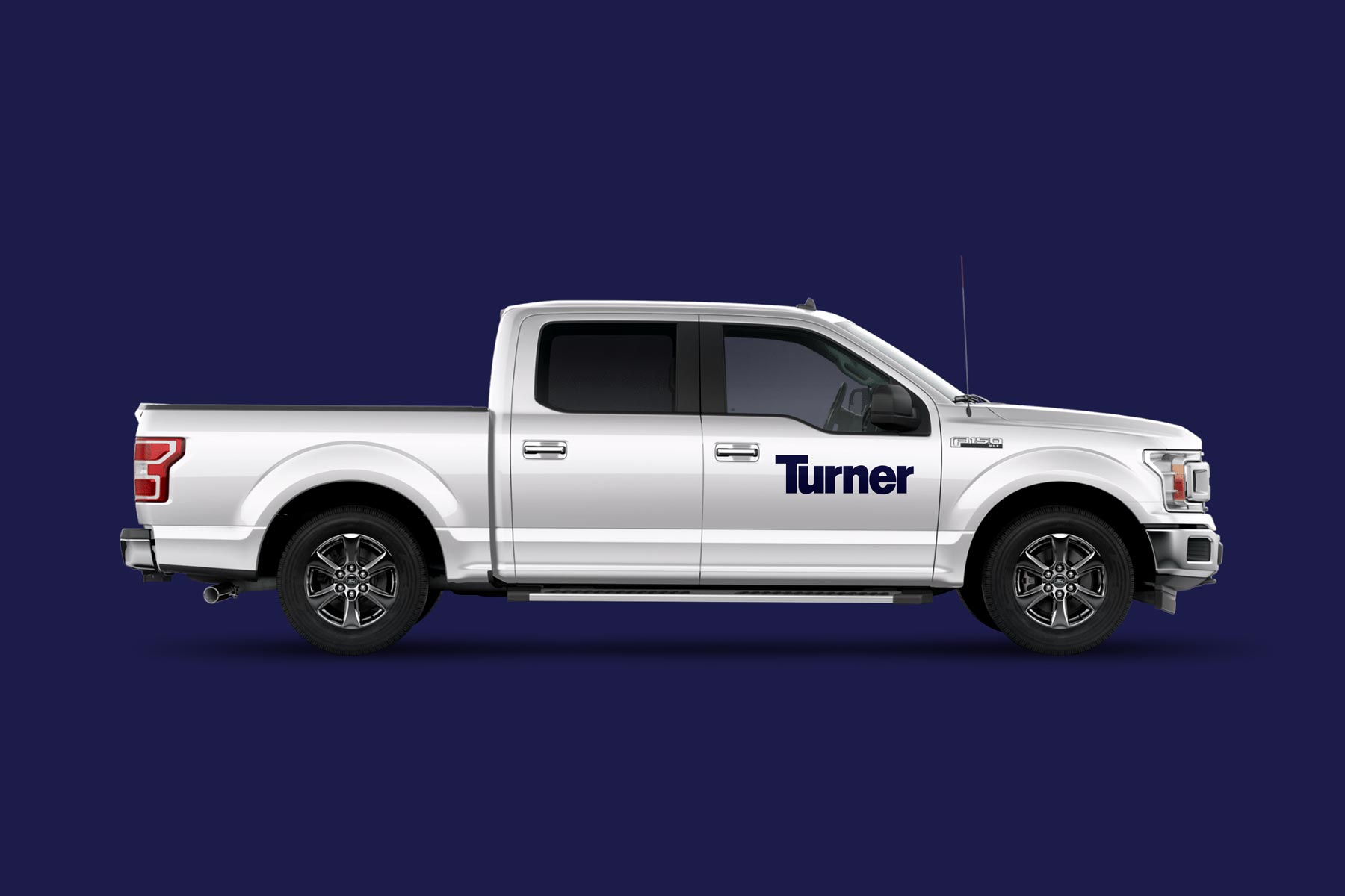
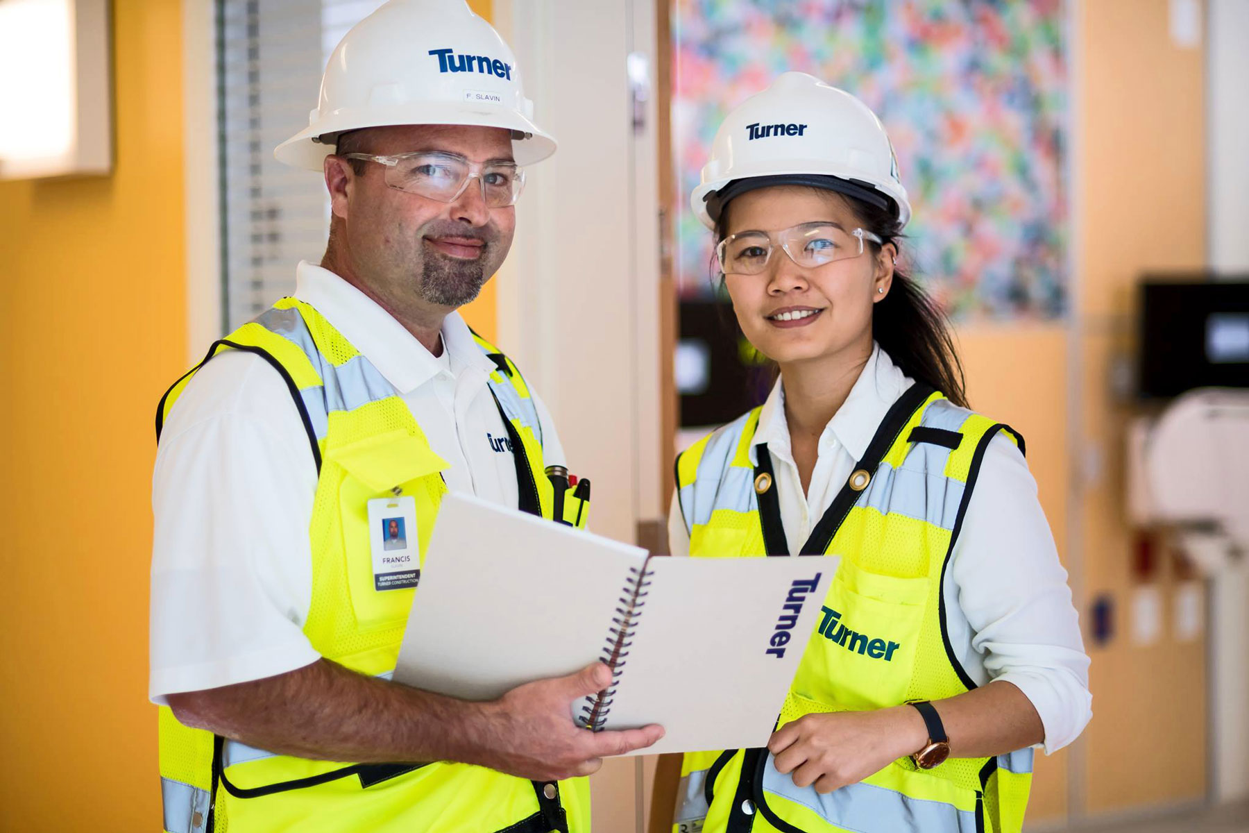
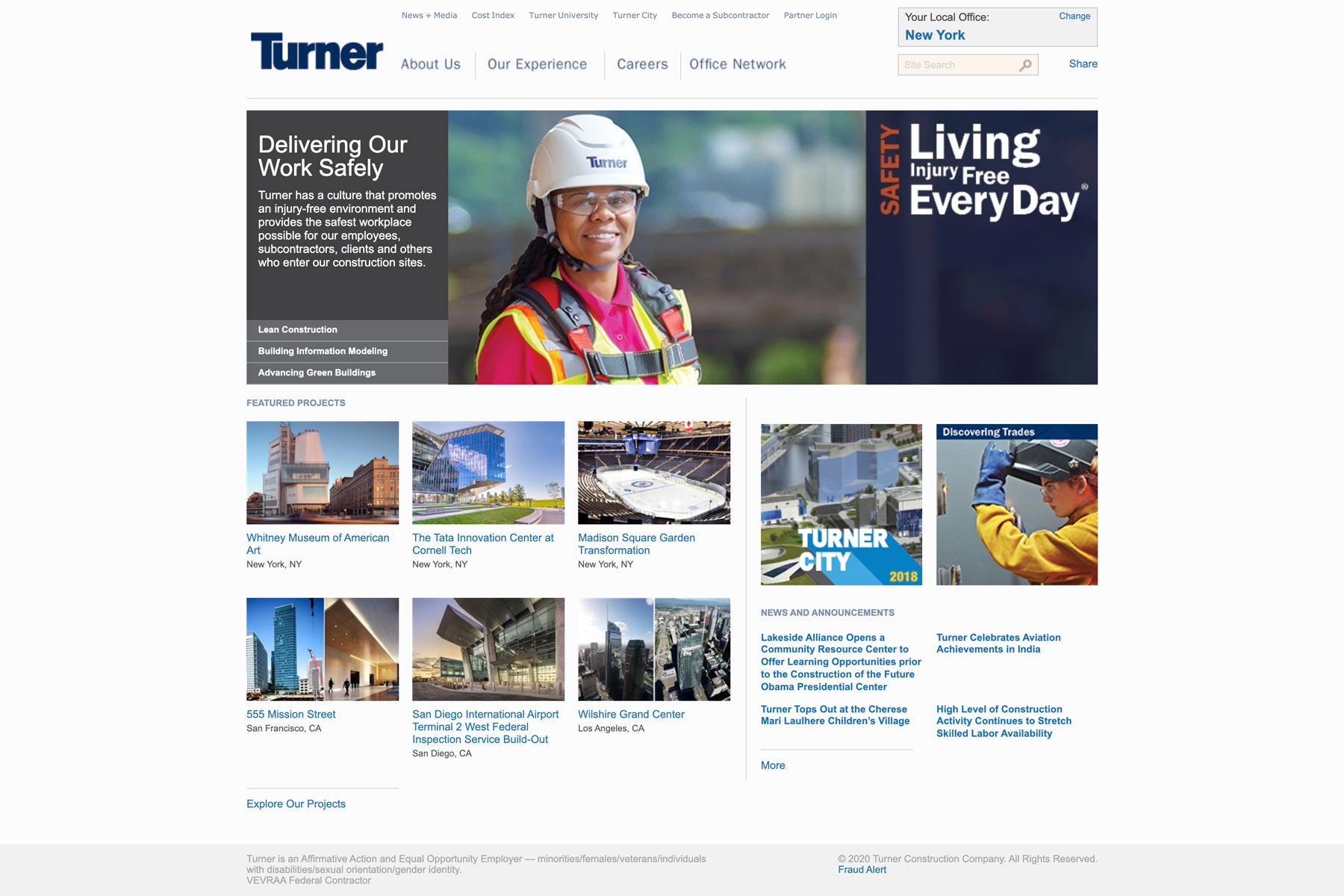
Since their logo is simple, it works perfectly on vehicle graphics and hard hats. When they get around to redesigning their outdated website, the logo will work with modern web design quite well.
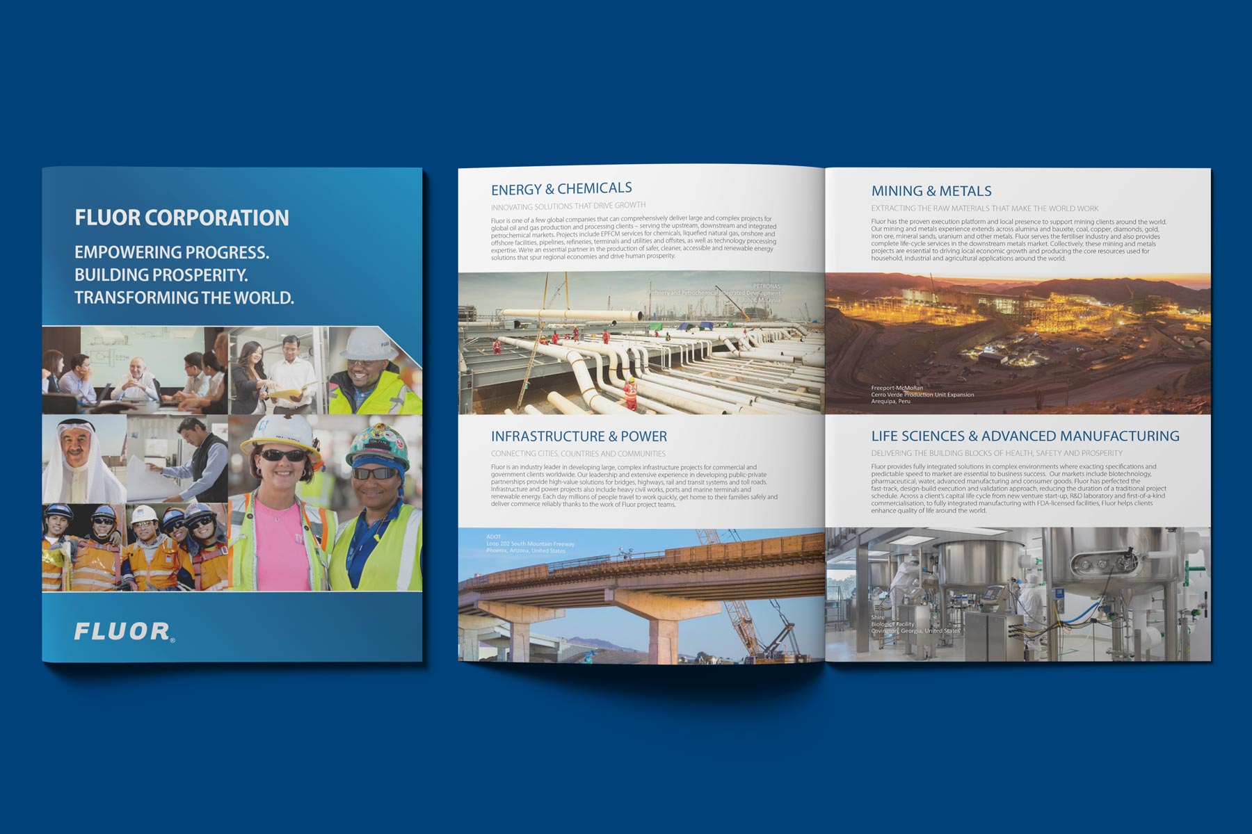
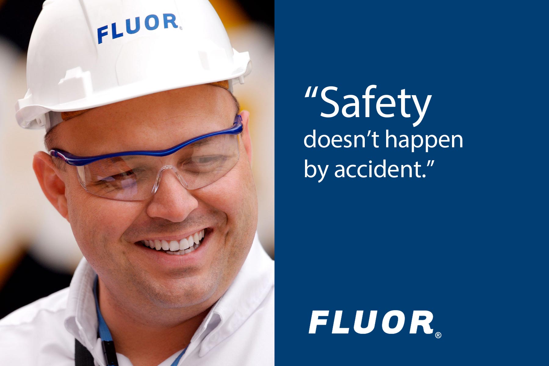
2) Fluor
![]()
ABOUT
Founded in 1912, Fluor Corporation provides services in the following areas: oil and gas, industrial and infrastructure, government and power. Fluor works closely with governments and companies to design, build and maintain complex projects. Fluor has more than 53,000 employees worldwide and is headquartered in Irving, Texas.
OPINION
The font Fluor uses for their wordmark is Tarzana Wide Bold Italic. Very little is done to the type except for adding extra spacing between the letters–a little more spacing than I would have added. Under most circumstances, we recommend stylizing the letters at least a little bit, so the logo doesn’t look generic. In this case, Tarzana is such a unique font that it really doesn’t need to be altered.
1) Bechtel
![]()
ABOUT
Bechtel Corporation is an American engineering, procurement, construction, and project management company. They were founded in San Francisco, California, in 1898 and are now headquartered in Reston, Virginia. Bechtel serves the infrastructure; nuclear, security & environmental; oil, gas & chemicals; and mining & metals markets. They are the largest construction company in the United States.
OPINION
This is the one logo on the list that I would not consider to be a simple logo. It’s more like a badge on top of an illustration. The color combination of the red and grey globe with the black and white Bechtel badge is striking, but the 3D globe rendering complicates the logo significantly. When you add this level of detail to your logo, it will be more difficult to reproduce. This cannot be embroidered without modifications. It will also be difficult to reproduce as vehicle graphics and building signage.
The marketing visuals produced at Bechtel are nothing less than extremely well done. The photography, the colors, and the layout are fantastic. The main issue I have with the logo is that it will not reproduce well in many applications—unless you choose the most expensive printing option all the time—but if you are the largest construction company in the United States, then maybe that's ok.
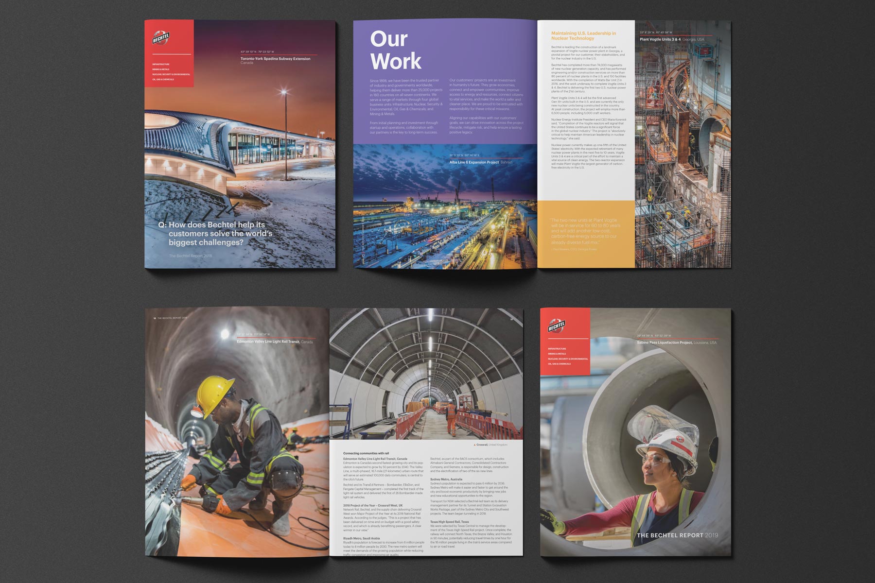
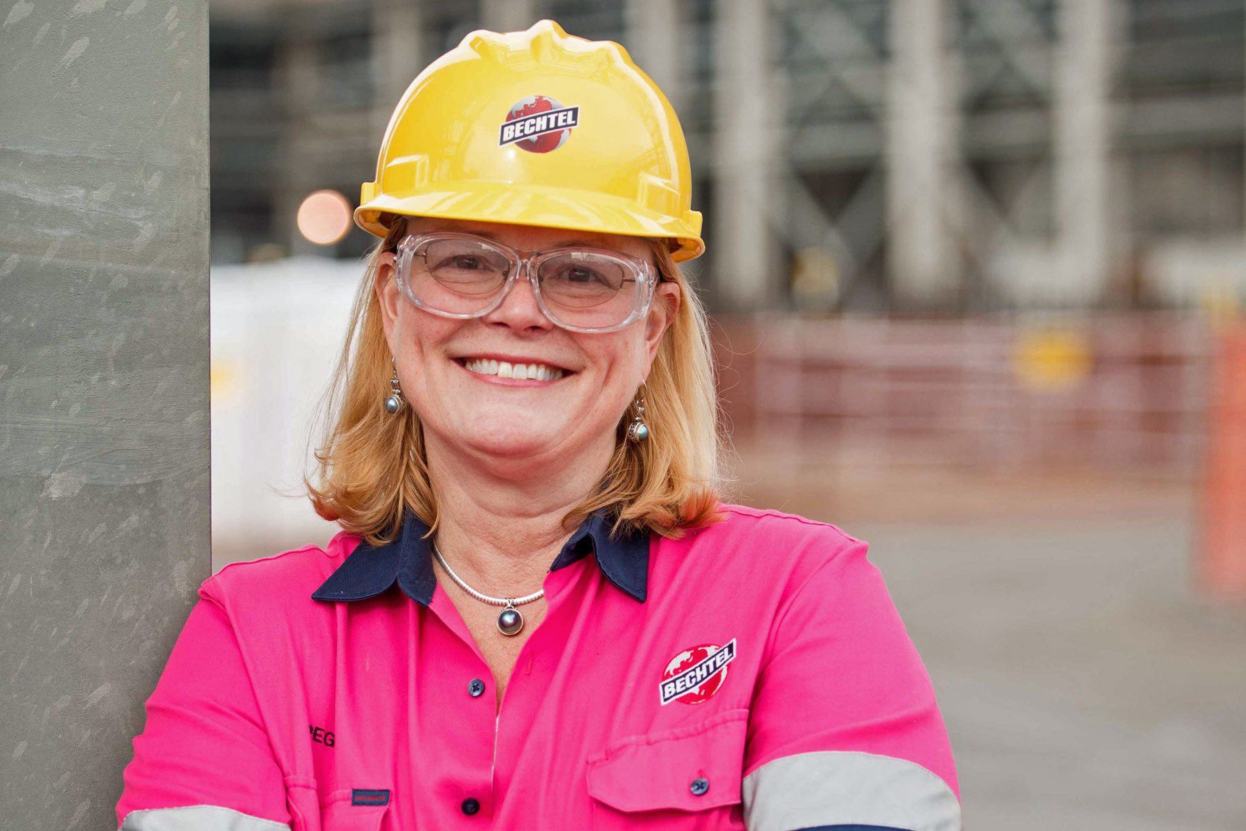
I can understand why they're keeping the globe. It has been used in the Bechtel logo for a long time, and removing it just may not be an option. Also, it gets across the message that Bechtel is a global company.
Experience Shows That You Will Be Happier With a Simple Logo for Your Construction Company
As your company grows, your logo will need to be reproduced for a wide variety of purposes using countless different methods. If your logo is complicated, then it is more likely you will run into problems along the way.
A summary of logo styles used by the construction companies in our list:
- 5 are only the company name without any symbols or illustrations
- 3 add very simple shapes to the company name—an oval for PCL, a bracket for McDermott, and a WT lettermark for Whiting-Turner
- Only 2 of the 10 logos have a complicated crest or illustration—Kiewit and Bechtel
Each of these companies has been around for over 100 years, and their logos have evolved over time. They have learned that the simpler the better. Unless you have a very good reason for including a complicated crest or illustration in your construction logo design, then it is best to leave it out.
If you are interested in learning more about our approach to the items discussed in this article, call (970) 744-3611 or send us an email so we can talk about what that would look like.

Warren Diggles
President and Creative Director