Top 10 Northern Colorado Logo Designs
What makes a logo iconic? Is it its ability to be recognizable? Is it its ability to be eye-catching without being complicated? How about its versatility or how representative it is of its company? If you guessed yes to all of the above, you know what it takes for a logo to be considered great.
All of us at Diggles Creative were tasked with choosing our favorite business logos. The criteria was all of the businesses had to be founded in Northern Colorado and the logos had to still be in use. We’ve based our selections on how well these logos represent their company’s mission and how recognizable they are among the competition.
Take note! You could learn a few things about the importance of logos from these companies.
10. Poudre River Public Library District
Locating in Fort Collins, Poudre River Public Library District starts our countdown of our top 10 logos, but don’t brush this profound logo off.
![]()
A perfect icon of Poudre River Public Library District’s mission statement, their logo (1) represents the “free flow of information [that] cultivates growth and serves as a steady, limitless source of renewal for all of its communities,” just as the Cache la Poudre River acts for life in the region. The colors of the logo are reminiscent of the high plains area and the flowing stripes not only remind us of the Poudre, but also of the pages of a book seen from the side. Pretty neat huh?
9. Miramont Fitness
Simple, yet strong, the logo for Miramont Fitness is a great example of how a logo needn’t be overly complicated or flowery.
![]()
The strong, radiating “M” of Miramont’s logo makes it easily recognizable as a professional place for fitness. The “M” is also reminiscent of our magnificent Rocky Mountain Front Range, with their strong peaks set against our fabulous blue skies (want to visit yet?) With or without the blue, Miramont’s logo is easily recognizable, even to those of us that haven’t stepped foot in a gym for years!
8. Heska
Are you seeing the common theme here? As a Loveland, CO company, it's something Heska does so well, representing your region of business is one way of embodying your business in your logo.
![]()
Heska is a Lakota Sioux word meaning “white or shining mountain.” The light purple mountain imagery gives homage to the place where it was founded (Fort Collins, CO) and to the Heska culture, dedicated to always achieving new goals or heights. The all caps, sans serif font and cool color give a sense of professionalism and serenity.
7. Wolf Robotics
With a name like Wolf Robotics , you have to have an equally awesome logo. Located in Fort Collins, the industrial robotics company is one of our favorite logos for obvious reasons.
![]()
It’s bold, geometric wolf along with its bright red background is a powerful ode to the company’s impressive (and dare we say intimidating?) robots. Originally orange, the background was changed to red in 2015 when Lincoln Electric (who’s brand features the same red) acquired the company. We like to think the color is the same as the bright sparks that fly from the arcs of the welding robots. What do you think?
6. Odell
Where would we be without including a brewery logo in our list, right? It is Northern Colorado. Fort Collins based Odell Brewing Co has become one of the most iconic brewery labels around; it’s no surprise it’s managed to survive alongside other breweries like New Belgium (more on them later.)
![]()
It’s signature crown or bottle cap logo with an aspen leaf (another ode to Colorado!) is easily recognizable among the plethora of beer logos. Odell’s logo has a slightly hand drawn or illustrative look that’s indicative of their passion to constantly create and experiment with new hand-crafted brews. Still readable and eye catching in color or black and white, Odell holds a special place in our design and beer loving hearts.
5. Gerrard Excavating
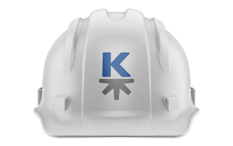
The construction logo design (2) for Gerrard Excavating uses both colors and shapes to subtly represent the company’s role as one of the largest infrastructure/site development contractors in the northern Colorado region.
![]()
The professional blue and earthly green give us a good clue into what industry Gerrard is in. Of course, if that doesn’t tip you off, the general shape of excavating equipment framing the “G” should! Gerrard Excavating can often be found in the field, so it’s important to note that Gerrard’s logo can be easily recognized both near and far.
4. Otterbox
Oh Otterbox , don’t you know it’s cheating to have a cute furry creature in your logo? In fact, you might ask, why does Fort Collins based Otterbox have an otter as a part of their logo?
![]()
Well, just like an otter, Otterbox’s products are waterproof and float! Clever huh? We thought so too. Along with their clever use of an animal icon, Otterbox’s logo’s color is also now a recognizable part of their entire brand; it’s playful yet reminiscent of protection and safety.
3. Colorado State University
Alright, so a few of us here at Diggles Creative may be Colorado State alumni, but that doesn’t affect the fact that the logo for CSU is one of the best in northern Colorado.
![]()
Just look at it! The Ram’s Head is CSU’s official logo and is recognized across Fort Collins, Colorado, and the US. The brilliant gold and green harken back to CSU’s start as Colorado Agricultural College. The symmetry of the CSU ram give it a balanced look that creates a stable and strong logo, perfect for both the academic and athletic roles of the college.
2. Food Bank for Larimer County
The Food Bank for Larimer County is an exquisite example of how simple logos can be a perfect representation of a company or organization.
![]()
Just look at the kerning of those letters, will you? (Alright, we’ll tone it down.) The Food Bank’s logo (1) is clean, crisp and clear. Along with its simple illustration of wheat, the logo is a perfect representation of the Food Bank’s simple yet soulful mission to provide nutritional assistance to the community.
Ironically enough, the Food Bank is in the process of rebranding. We can’t wait to see their new logo (even if we still love their current one!)
1. New Belgium Brewery
Drumroll everyone! We told you we’d be talking about New Belgium Brewing!
In 2006, New Belgium Brewery rebranded and created the now easily recognizable logo you see today. Designed by Anne Fitch, founder Kim Jordan’s neighbor, the logo “pays homage to the well-known Fat Tire brand bicycle.” (3)
![]()
From humble beginnings in a basement to being known across the nation, the bicycle logo is easily spotted on taps and on shelves. New Belgium has even simplified the logo over the years, to the point where today all we need to see is the bicycle icon by itself to recognize the Fort Collins craft brewery.
Footnote
We reached out to all businesses in hopes of finding out more about their logos. While we recieved some replies, we were unable to find out who was behind all of the designs. If one of these logos was created by you or your team, please let us know and we will give you your well deserved credit!
If you are reading this article, you might be wondering if hiring a branding design agency will help your business. Check out our marketing case studies to get an idea of how we can help you.
If you are interested in learning more about our approach to the items discussed in this article, call (970) 744-3611 or send us an email so we can talk about what that would look like.

Abby Jacobs
Marketing Associate